I don’t know about you, but I love tinkering with new technology and services online to find out how they tick and ways they could be improved. At CDNify everyone tries to take this approach, so if we feel that something isn’t the best it can be we take a step back, analyse, improve, and deploy. So we went full terminator and critically thought about how we could improve our services.

Introducing CDNify’s new dashboard: A brand new and improved control panel that makes it easier to manage your resources.
What’s changed?
The main and most notable difference is the new look and feel – We’ve shifted everything around to make it easier to locate resources and settings without having to think about it, so it has a more natural and intuitive feel to it. Other notable changes include:
Improved data
Data representation is an important part of the dashboard as it shows how much you’ve used and have remaining, where traffic is coming from, and specific resource figures. The old dashboard used to look like this:
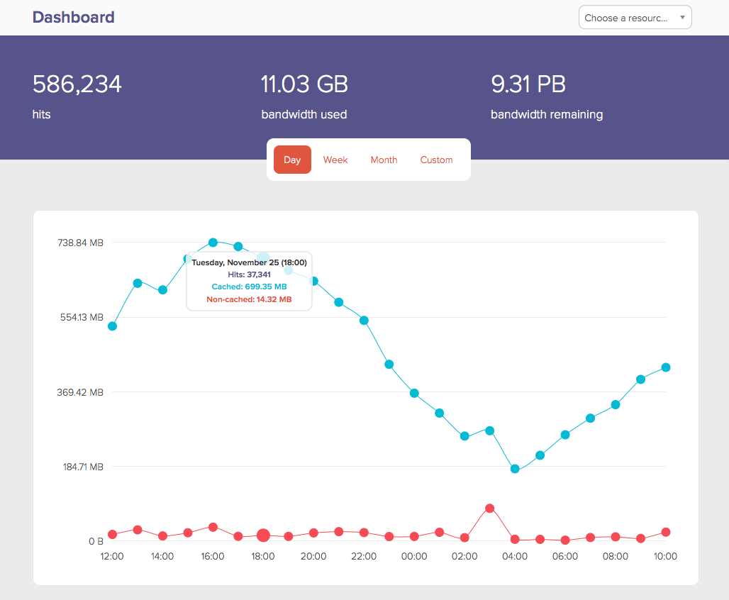
We’ve changed the graph so it’s a little easier to find, the stats have been improved so they accurately reflect how much data is used in terms of cached and non-cached traffic, and the way data is represented in the graphs:
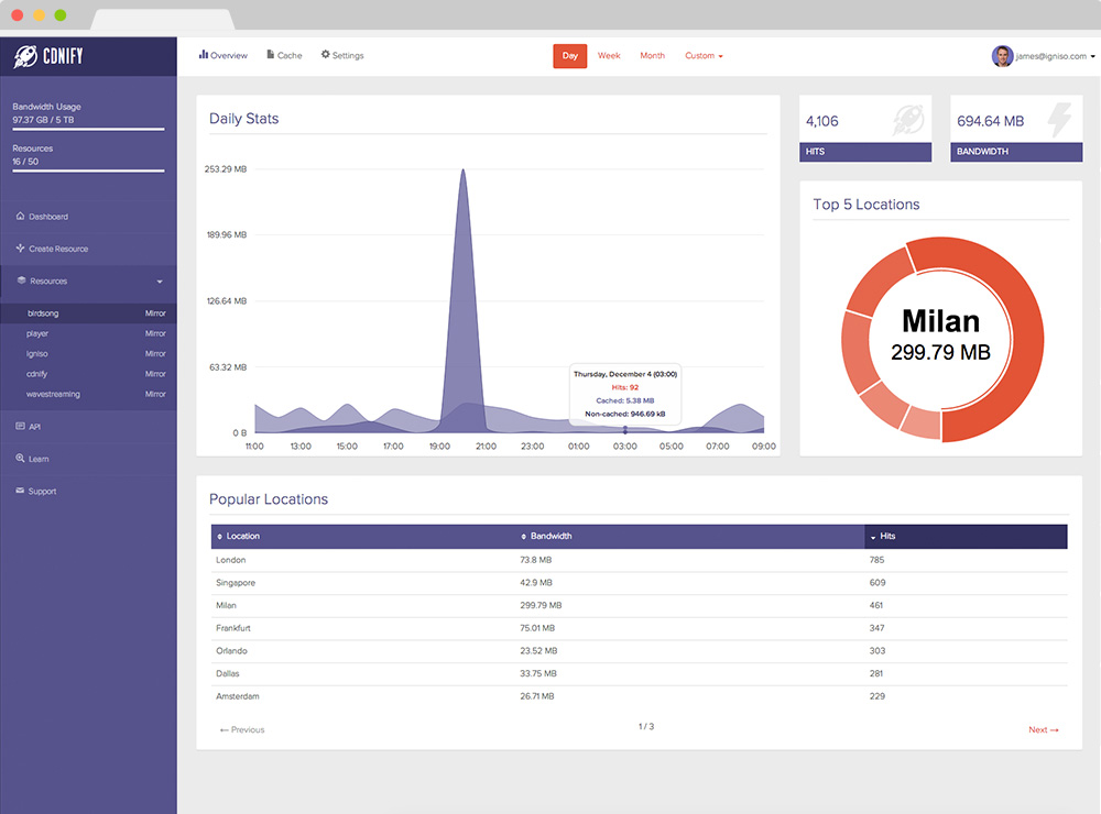
Layout overhaul
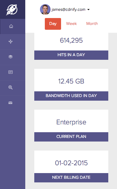
Each area is now chunked into smaller, more accessible bites of info so it’s not only easier to find out things like how many hits you’ve had in a day or how much bandwidth you’ve used so far, but it allows us to keep on adding these little sections as time goes on.
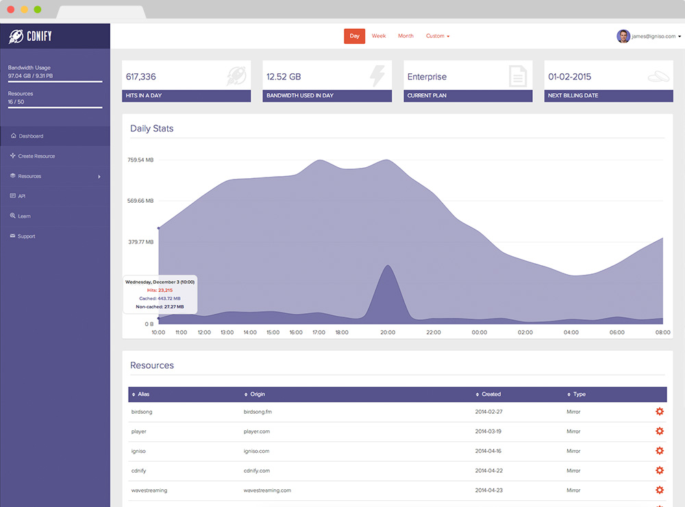
You can now see more, so things like current plan and next billing date are added as little cards so you’re always in control.
Responsive design
We noticed we had a lot of users accessing their dashboard on mobile devices, but the control panel wasn’t as responsive as we’d have liked as smaller screen sizes struggled to represent content correctly.
With the new dashboard you can adjust the window to fit your view and access the control panel area on your tablet or phone to display your resource’s data accurately, this way your experience is smooth on both desktop and mobile devices.
But wait, there’s more!
One of the big reasons behind the new user interface overhaul is because big changes are coming in terms of functionality. We’ll be adding new features incrementally over the weeks to come, so with the way the new dashboard is designed these additional pieces can be slotted without disruption.
Not with us yet? Get started over at cdnify.com/pricing.